Skip to Main Content

Best practices for data visualization

Here are a few simple tips for you to follow:

Pay attention to basic elements

  • Give your chart a title
  • Label your chart element
  • Include a source line
  • Display enough data to provide context

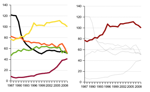
Simplify less important information

  • Simplified chart elements to highlight what is most important

Use color carefully.

  • Use sequential single hue color to show numerical values
  • Stick with 6 colors max for categories
  • Remember some people have color blindness

Include a textual description of the visualization in surrounding text, and include alt text for the visualization when it is in an image format.

  • This helps make the visualization accessible for people who use screen readers.
Data visualization example with caption crediting the source of the data and linking to the source.

Link to the source of the data.

  • Preferably, link to a format of data that can be read by a screen reader, such as a CSV file.

For additional information about making accessible data visualizations, see the University of Wisconsin-Madison's guide, which is also the source for the final two tips in this list.