Types of data visualization
A bar chart is one of the most commonly used forms to present quantitative data. It is simple to create and to understand. It is best used when comparing data from different categories. Bar chart is simple: We usually have a few values – ordered as categories on the x or y axis. Then we have the values expressed as bars (horizontal) or columns (vertical). The extent of the bars is the value.

Cole Nussbaumer, my penchant for horizontal bar charts
A pie chart is used to display proportions of a whole. These charts are useful for percentages. When making a pie chart, please note:
- All portions should add up to a total of 100%.
- Sizes of the portions should represent their value.
- Not too many variables

Source: World Travel & Tourism Council
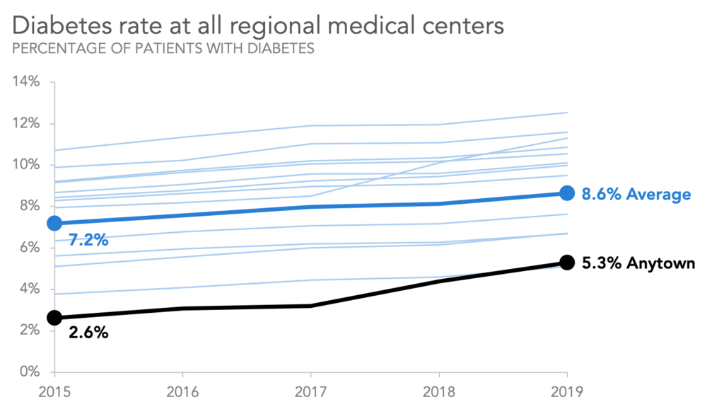
A line chart is a type of chart used to show information that changes over time. We plot line chart using several points connected by straight lines. The line chart comprises of two axes known as 'x' axis and 'y' axis. The horizontal axis is known as the x-axis.
A scatter plot is a type of plot or diagram to display values for typically two variables for a set of data.
Scatter plots show whether there is a relationship between two variables. The trend line shows the central tendency of the data.

A box plot or boxplot is a method for graphically depicting groups of numerical data through their quartiles. Box plots may also have lines extending from the boxes indicating variability outside the upper and lower quartiles.

Box plot of data from the Michelson–Morley experiment
Whenever you have a large number of countries or regions, displaying data on a map helps. If you have countries or regions you usually create a choropleth map. This special type of map displays values for a specific region as colors on that region. Some things to be aware of when using choropleth maps:
- One shortcoming of choropleth maps is the fact that bigger regions or countries attract the most attention, so smaller regions may get lost.
- Pay attention to color-scale. The standard red-green color scale is not very well suited for a variety of reasons such as making it difficult for color-blind observers. Single hued color scales are in most cases easier to guess. If your range of values becomes too big it will be hard to single out things

Drzyzga, S. (2009). Prevalence of Foodstamp Use.
Word cloud: Word clouds visualize the words in a text. The more often a word is used, the larger it appears in the word cloud.

Pyrsmis. (2011). Word cloud comparison of two State of the Union speeches by two U.S. presidents.
Histogram: A histogram is a column chart that groups the data into categories and then displays how many items fall into each category. It is a more advanced version of a bar chart.

Pyrsmis. (2008). Black cherry tree histogram.
Area chart: An area chart is very similar to a line graph, but the area below the line is usually colored in.

Grape City, Inc. (2009). Spread 5 for Windows Forms.
Heat maps: In a heat map, the data points on a map are color coded. This allows a viewer to easily see concentrations of data. Heat maps are often used to show crime, weather or population.
